Fundamental NGX
User Interface Design / January 2024
Project Overview
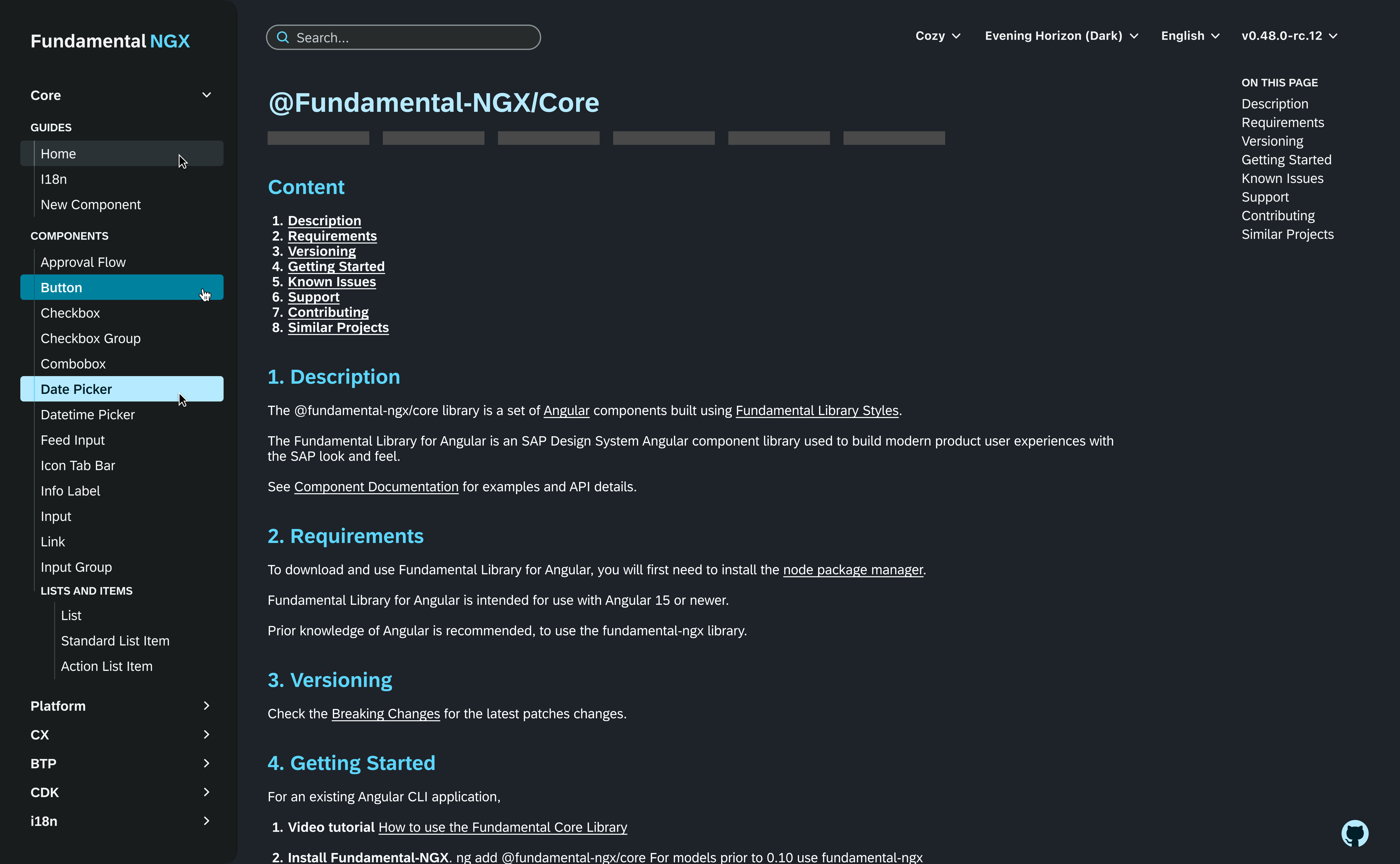
During my time at SAP, I worked under the Fundamental Library team (you can also view the site I designed for the teamhere). Fundamental NGX is where users go to view and download Angular components. Here, I redesigned the side navigation, search, and workspace controls to better direct and simplify user tasks.
My Contributions
In this project, my contributions consisted of researching component standards, experimenting with layouts and colour hierarchies, and implementing an accessible solution.
Team
Individual
Timeline
3 weeks
The Problem
To begin, my management team identified the following problems with the Fundamental NGX site:
-
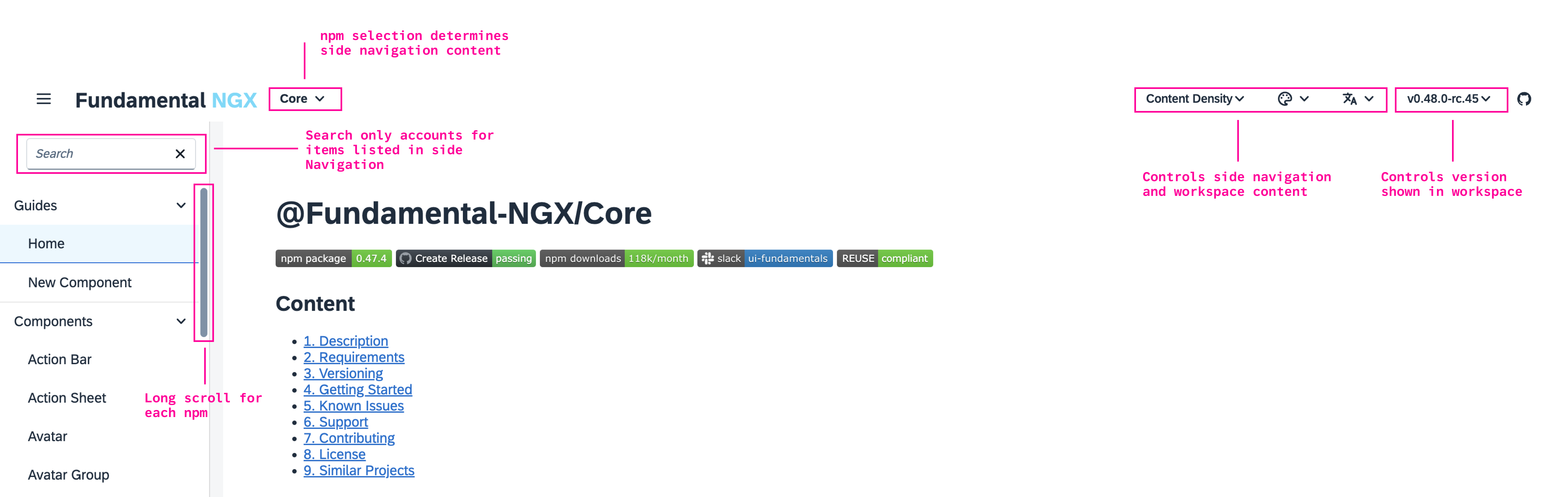
Side Navigation
- Selecting an npm should the first step in the side navigation journey. However, because the button is placed outside the side navigation, users may explore the side navigation first, or miss the button completely.
- The side navigation has all elements open, and allows users to close as they see fit. This is not necessarily a problem, but rather an opportunity to explore.
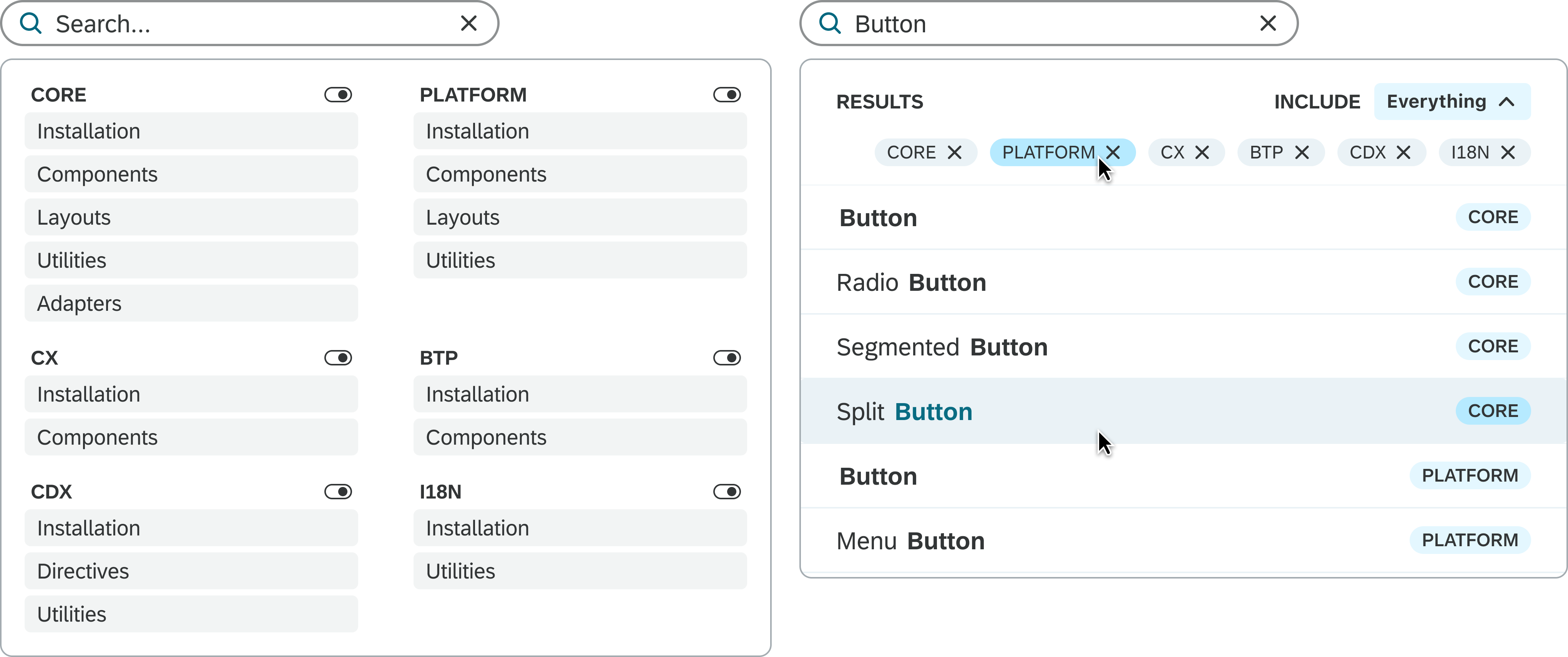
- The search only filters content currently shown in the side navigation. Therefore, if a user searches "button", they will only see results from the selected npm.
- The content density button shows how various components can be displayed. However, this button currently impacts both the workplace content as well as the side navigation, making the placement confusing.
- Likewise, the other buttons influence the side navigation and/or the working space. This gives an opportunity to better label or group controls.
Search
Right Contents
Concepting
With the problems in mind, I got to work. Presenting each iteration to my team for feedback regarding user needs, accessibility, and feasibility.
In this stage, I designed 18 side navigation variants, 5 search variants, and 5 workspace button variants.
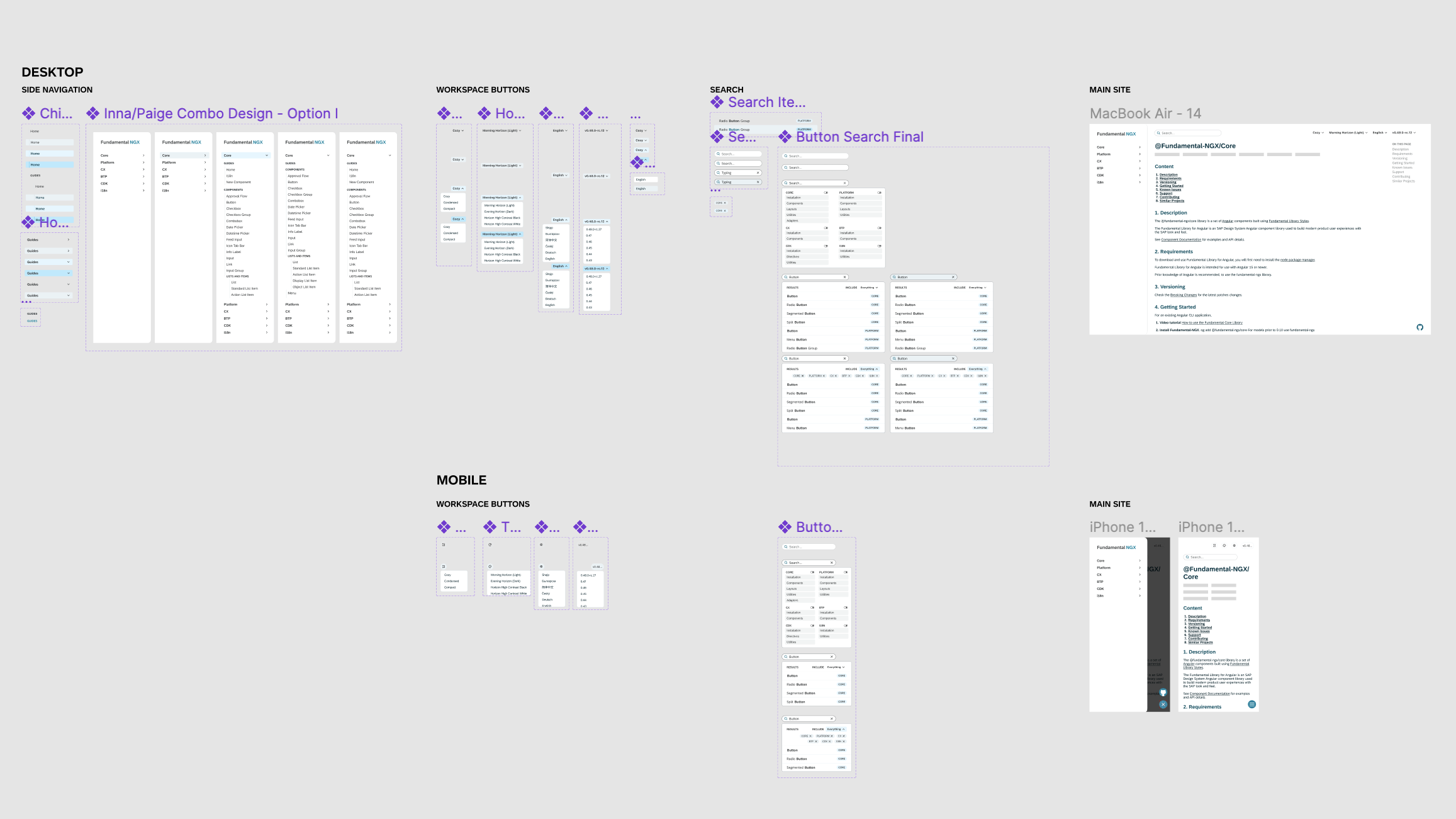
Photo shows final workspace
Side Navigation
Final Three Options
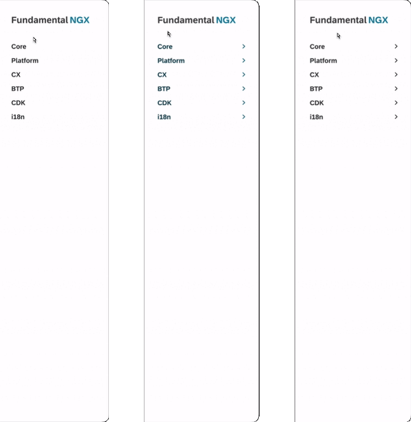
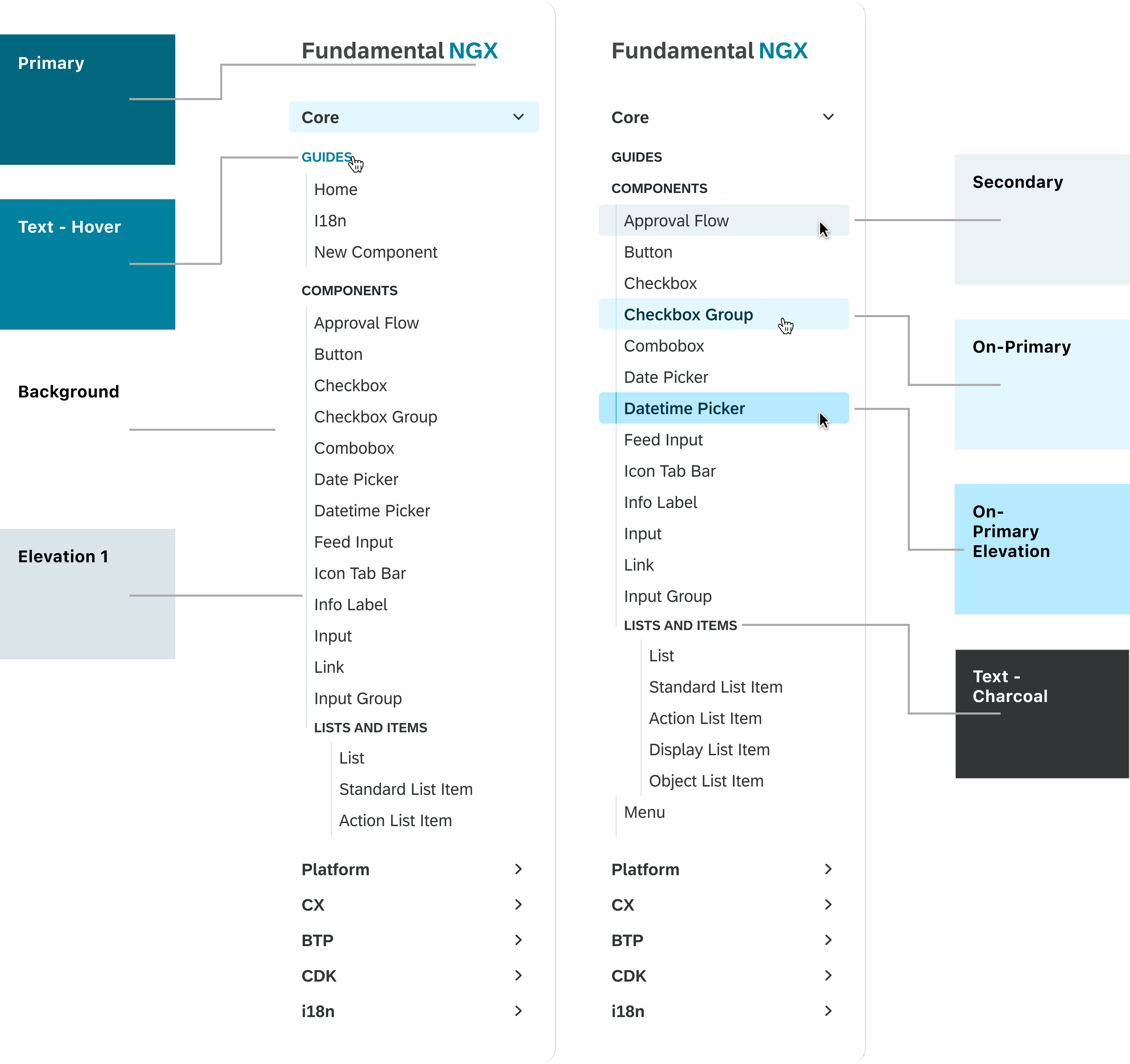
For the side navigation, the final three options show the impact of small UI decisions.
- The first option focuses on hidden micro-interactions, and minimal background affordances.
- The second option utilizes the primary colour, which ultimately may contribute to cognitive overhead.
- The third (and chosen option), expands off the second iteration, but uses the primary colour sparingly.
Side Navigation
Design Decisions
The final side navigation allows users to first select their npm of choice. I experimented with a few different options here such as selecting an npm then including a back arrow to reselect a new option, or implementing a dropdown menu for npm within the component. However, the final decision landed on keeping all npms always visible on screen while supporting a vertical scroll within these buttons. By making this decision, I created two options for navigation: selecting an npm while another is open, or closing the current npm and selecting another using the default variant.
I decided to use the primary colour sparingly, correlating this design with industry standards and reducing stimulation. I implemented different typography styles for the npm selection, parent items, and child items to ensure that even with various colour blindness’s, this component will be accessible.
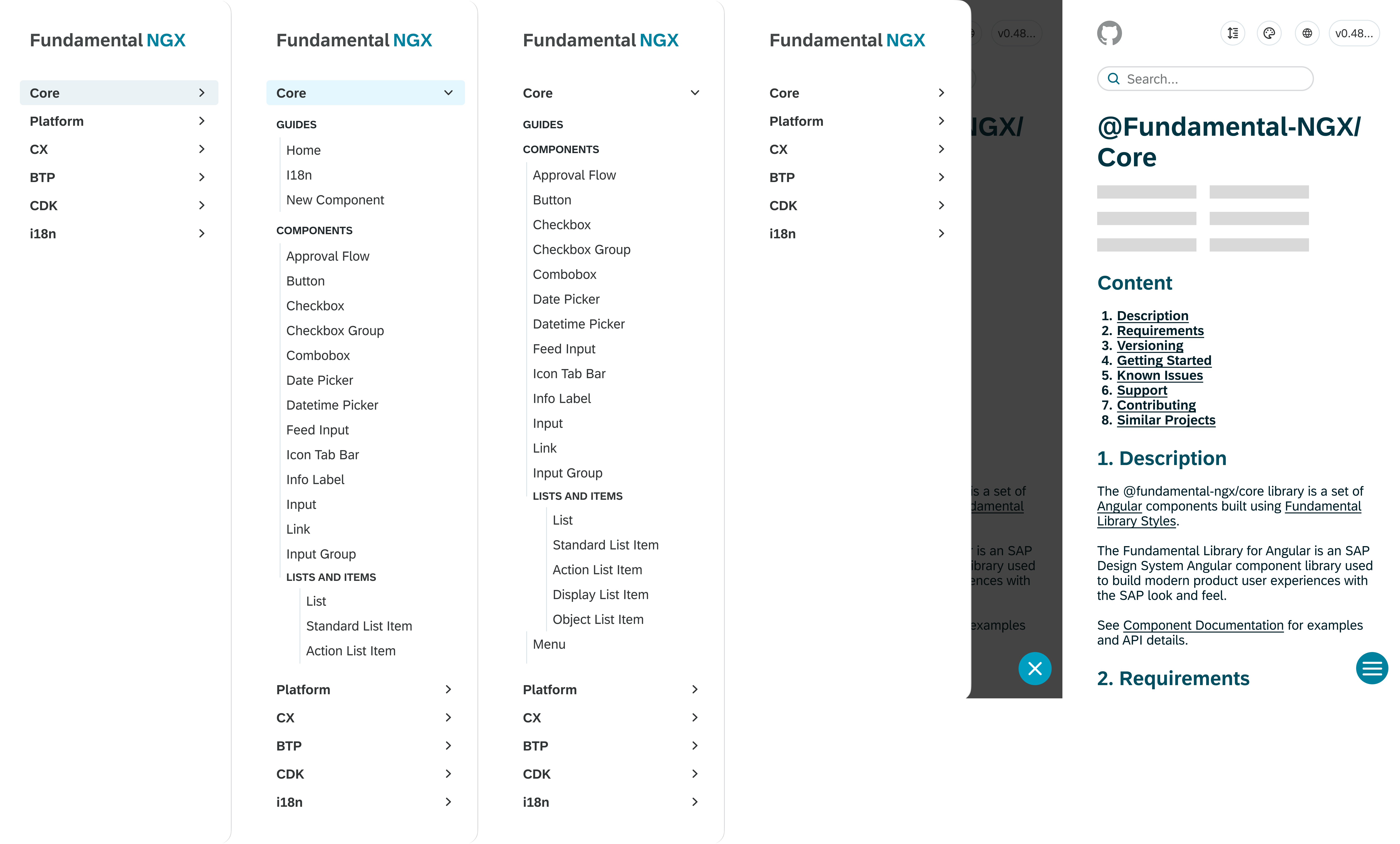
UI Design System
The UI Design System for the Fundamental NGX rebrand uses Google's Material Design System. I used this to design an interface built on elevations, preventing accessibility issues.
Search
Design Decisions
In the problem section of this page, I outlined an example where if a user wanted to search for a button, they would only see search results under the current npm. I adapted this component to begin with a filter option, allowing the user to deselect any npm if they are looking for something more specific. When the user searches, they will see every correlating name for their search along with a badge identifying which npm package it is under. If the user wishes to filter out npms during their search, they can select the "everything" button, where they have the option to deselect npms once again.
Workspace Controls
Design Decisions
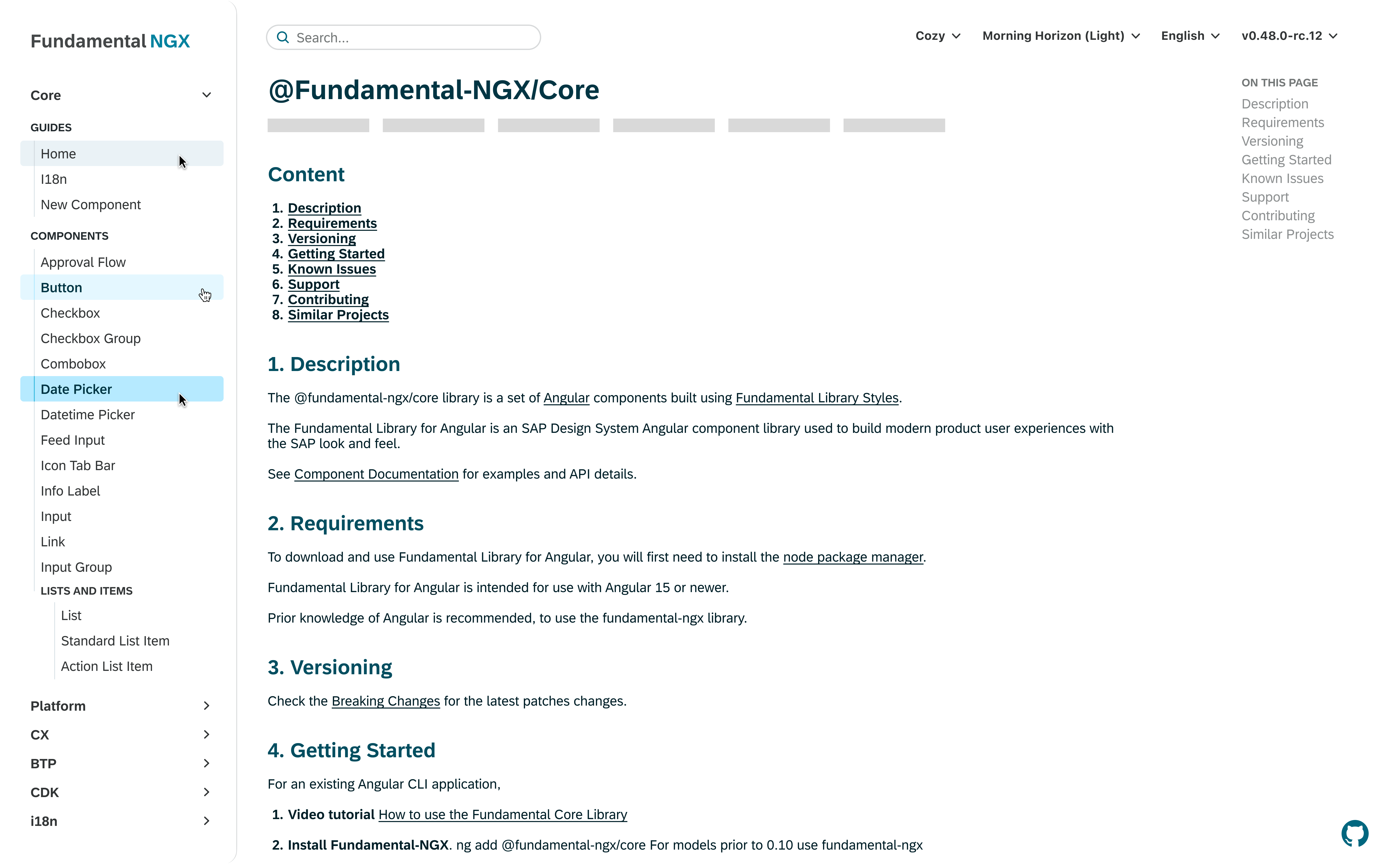
For the workspace controls, I started by pulling out the github icon as it did not relate to the rest of the cluster. Next, I changed the function of the content density to only impact the workspace. The original purpose of the content density button was to show how components change for desktop vs mobile platforms. Therefore, having the side navigation change to a mobile version on desktop did not make much sense.
Likewise, the theming button controls the workspace to show the flexibility of the components. The only selection that impacts the entire system is selecting any dark mode theme, which changes the elements I designed to their dark mode versions.
Lastly, the versioning only changes the workspace controls as it did originally. By grouping and programming these buttons in this way, it will create a more cohesive, and straightforward experience for the users.
The UI of the buttons follow the same design as the side navigation parent items to reduce cognitive overhead.
Theming
The images below show the flexibility of my design across light and dark modes.
Final Notes
This was the final project I completed as a User Interface Designer at SAP. Here, I learned to:
- Utilize industry standards
A huge aspect of user interface design is creating unique products that follow standardized affordances. In my process, I collected examples across various platforms to draw connections and gather inspiration. - Use pops of colour sparingly
I am a bright and bubbly person and designer, and I have always struggled to know where to stop adding new colours. In this project, I really challenged myself to utilize neutral shades to make interactions and affordances more impactful.