UI5con 2023
UI Design + Brand Direction / July 2023
Project Overview
This was the first project I worked on as a User Interface Designer at SAP. In this project, I was tasked with designing the brand direction for UI5con, a developer conference in Germany. I was in charge of all visual assets including the website, posters, slide templates, and social media graphics.
My Contributions
In this project, my role was UI design (website, mobile, participant app), graphic design, and brand design.
Team
Individual
Timeline
4 months
Assets by me, editing by Sebastian Moreno
Iterative Design
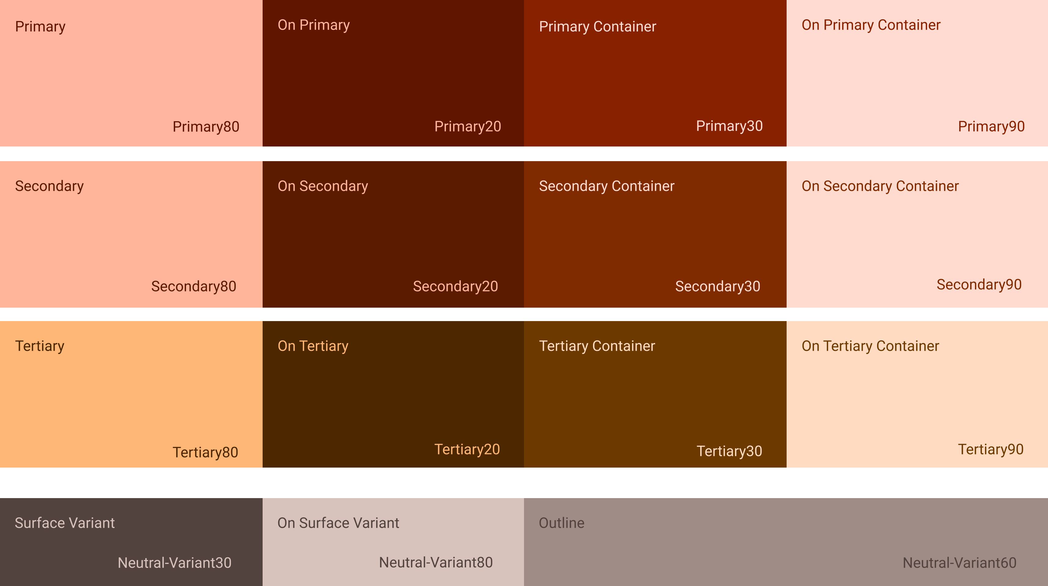
My direction for UI5con is an adaptation of previous years. UI elements such as type and colour are based on brand theming and could not be altered. In my approach, I used Google's Material Design System to create a tonal palette. The idea of this type of palette is to create surfaces along the z-axis with only one base colour. My goal was to reflect maturity and professionalism.
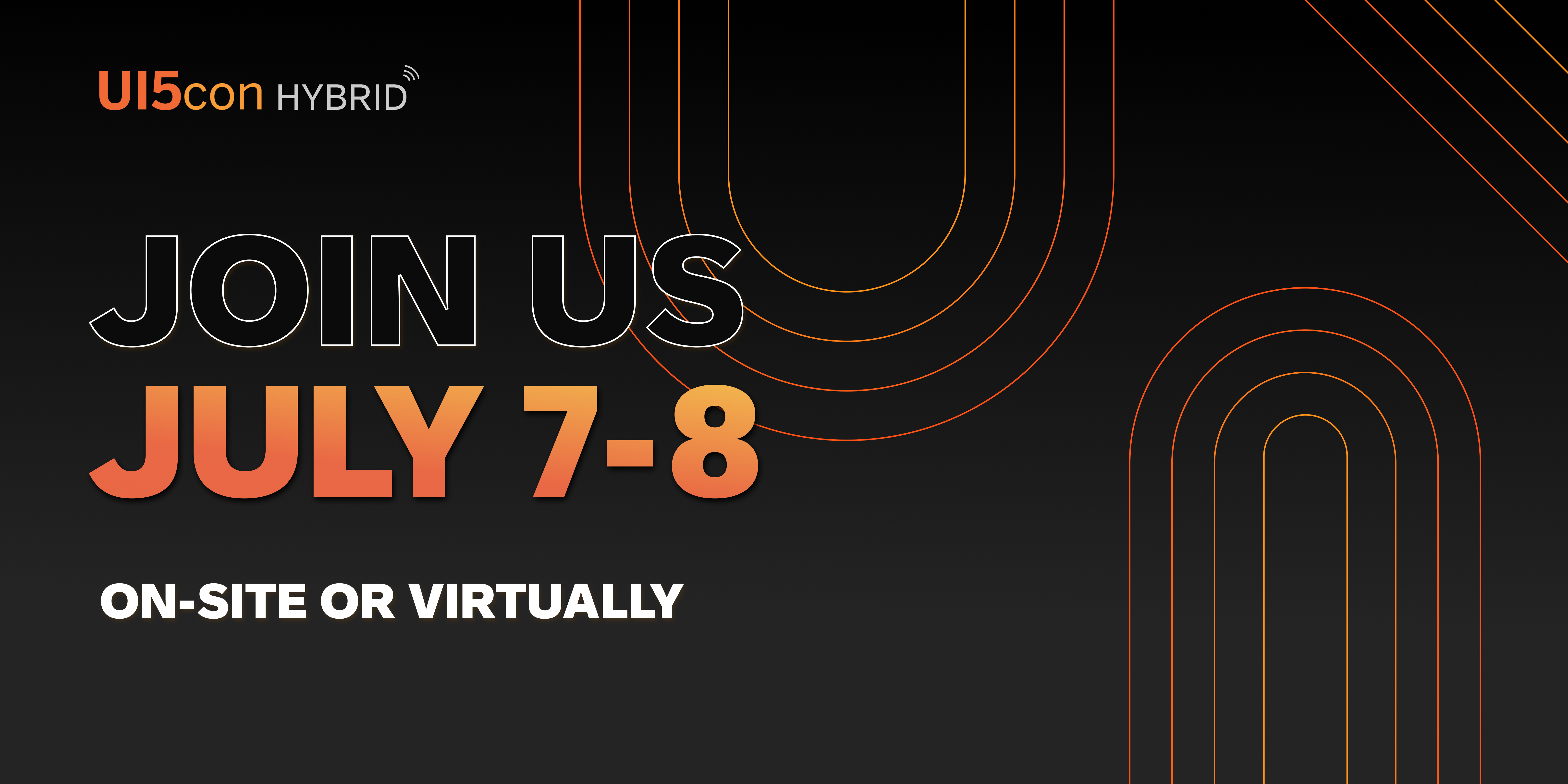
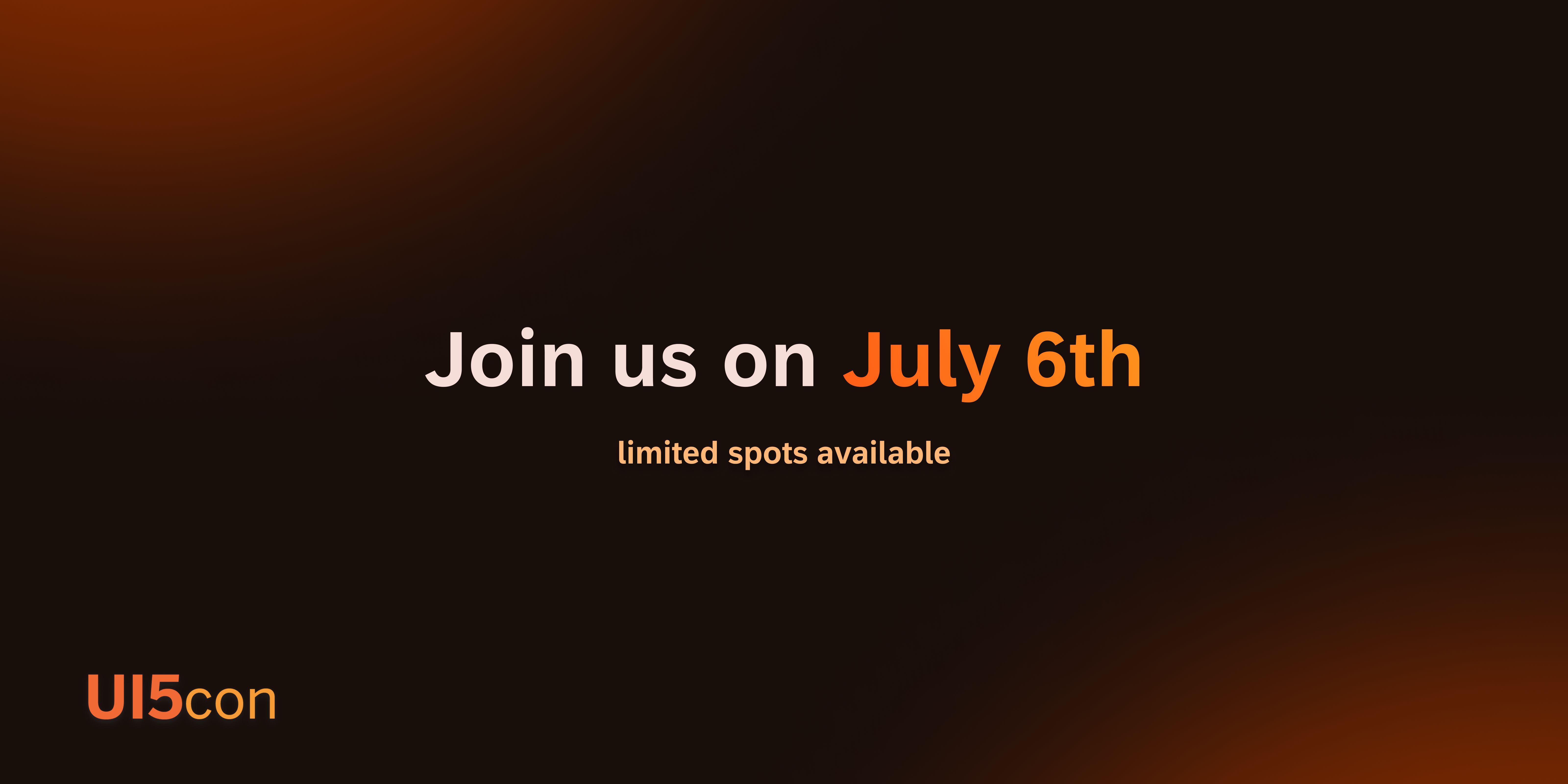
The first image is from UI5con 2022, and the second image is my design from 2023.
Colour Palette
Starting with the previous year's palette, I added the colours to the material design plugin on Figma.
I also used the stark accessibility plugin to denote colour contrasts across every element of my site.
The dark-mode theming allowed my design to have exceptional contrast ratios, and I am proud to note that
the site design is 100% accessible.
For accessibility purposes, the colours are used aesthetically and not functionally because
the contrasts between the primary, secondary, and tertiary colours are too similar which could not be
differentiated for individuals with specific blindness’s.
Movement
One of the elements that makes UI5con so great is the people. After speaking with some of the conference's stakeholders, I learnt that 75% of participants come every year. With that in mind, I wanted to have people at the center of this year's design, communicating the scale and impact of the event. I also added subtle gradient movements in the background to bring life into the components.

Site Design
I designed the site with a fluid responsive layout. Here, I used Figma's auto layout to denote how the components move with resizing, but also designed tablet and mobile break points for both aesthetics and function. Designing this site allowed me to have candid conversations with developers. I was inspired to learn about feasibility and have constructive discussions on implementation.
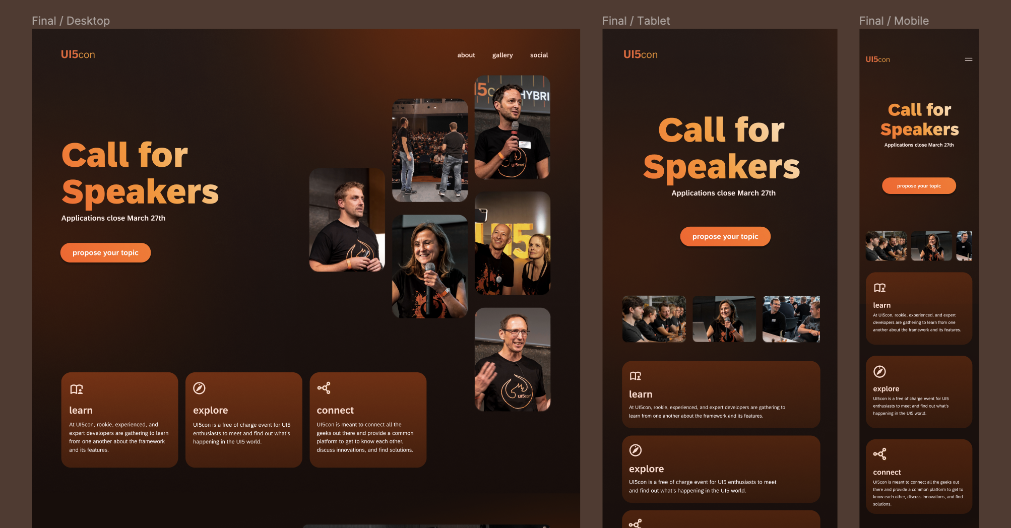
See the live sitehere
Final Notes
This was the first project that I completed as a User Interface Designer at SAP. Here, I learned to:
- Work collaboratively, internationally
In this project, my developer was in Montreal, Canada, while our project manager was in Walldorf, Germany. Working across various time zones taught me how to prioritize tasks and make workflows easier for my colleagues. - Trust my gut
As the only designer on this team, I had to be very confident in my design decisions. This is something I have struggled with in the past, but through intentional decision-making, I was able to justify all of my choices and execute a design my whole team supported. - Stay motivated
One of the biggest challenges of remote work (especially when you're the only colleague working in a different time zone), is to stay motivated. I find this is a huge struggle, especially in creative work. In this project, I learned to be kind to myself, knowing when I needed a walk outside or when I needed to schedule a 30-minute uninterrupted workflow.